

In today’s digital world, having a website is no longer an option – it’s a necessity. But simply having a website isn’t enough to stay competitive. With the rise of mobile browsing, tablets, and various screen sizes, your website needs to adapt seamlessly across all devices to provide users with an optimal experience. This is where responsive web design comes into play.
At WasatchWebsites.net, we specialize in creating modern, responsive websites that not only look stunning but also function perfectly on every device. In this blog, we’ll explore the importance of responsive web design, why it’s crucial for your business, and how it can improve your overall web presence.
What is Responsive Web Design?
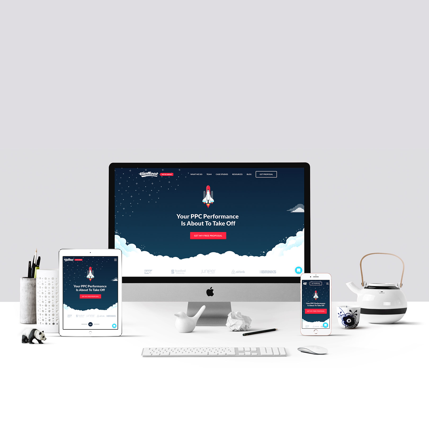
Responsive web design (RWD) is an approach to web design that ensures a website’s layout and content automatically adjust to fit the screen size, platform, and orientation of the device being used. Whether someone is visiting your website on a smartphone, tablet, laptop, or desktop, a responsive design ensures they have a consistent, user-friendly experience.
Responsive design uses a combination of flexible grids, layouts, images, and CSS media queries to adapt the website’s content dynamically. This approach eliminates the need for separate websites for mobile and desktop, streamlining the management process while providing users with a cohesive experience.
Why Responsive Web Design is Critical in 2024
As technology evolves, so do user expectations. Today’s internet users expect websites to load quickly and look great no matter what device they’re using. Failing to meet these expectations can lead to lost business and missed opportunities. Let’s take a look at some key reasons why responsive web design is essential in 2024.
With responsive web design, your website automatically adjusts to fit smaller screens, ensuring that the text is readable, navigation is smooth, and images scale appropriately. A website that performs well on mobile devices can significantly increase user engagement, leading to more conversions and better overall performance.
Responsive web design ensures that your website performs well on mobile devices, improving your chances of ranking higher on search engine results pages (SERPs). A higher ranking translates to more organic traffic, which can help boost your business without spending additional money on advertising.
Responsive web design ensures that users have a smooth, seamless experience no matter what device they’re using. With easy navigation, clear visuals, and fast load times, users are more likely to stay on your site longer, explore more pages, and engage with your content. The better the user experience, the more likely they are to convert into customers.
This not only reduces the time and effort needed for updates and maintenance but also ensures that your branding and content remain consistent across platforms. Responsive web design allows you to manage one website efficiently, streamlining the process and saving you money in the long run.
Whether your users are browsing on the latest smartphone, a tablet, or a device that hasn’t even hit the market yet, a responsive website will automatically adjust to meet their needs. This adaptability ensures that your website will remain relevant and functional in the ever-changing digital world.
A responsive website is designed with mobile performance in mind, ensuring that the site loads quickly on smaller devices with slower connections. Optimized images, efficient code, and streamlined design elements all contribute to faster load times, helping keep users on your site longer and improving overall performance.
Additionally, a consistent experience across devices builds trust with your audience. Users who have a positive experience on your site, whether on mobile or desktop, are more likely to return and recommend your business to others.
How WasatchWebsites.net Can Help You Implement Responsive Design
At WasatchWebsites.net, we understand the importance of responsive web design in today’s digital landscape. Our team of experienced web designers and developers specializes in creating fully responsive websites that adapt seamlessly to any device. Whether you’re starting from scratch or looking to upgrade an existing site, we’ll work with you to ensure that your website is optimized for the best possible user experience.
Here’s what we offer:
In 2024 and beyond, having a responsive website is no longer optional – it’s a necessity. A well-designed, responsive website improves user experience, boosts your SEO rankings, and ensures that your business remains competitive in an increasingly mobile world.
At WasatchWebsites.net, we’re committed to helping you build a website that not only looks great but also performs flawlessly across all devices. Ready to take your website to the next level? Contact us today to learn more about our responsive web design services and how we can help you create a digital presence that stands out.
Don’t Get Left Behind – Make Your Website Responsive Today!
Experience worry‑free WordPress hosting with automatic updates, top‑tier security, and expert support so you can focus on doing what you do best: growing your business.
Take full control of your website on our secure servers with straightforward FTP and control‑panel access—manage your site your way while we ensure uptime and maintenance.
Experience stress‑free domain registration with at‑cost pricing, free privacy protection, built‑in security, automatic renewals, and expert support.
Maximize your ROI and drive high‑quality traffic to your website with expertly managed PPC campaigns.
We’re developing softwares you can use for your business. AI Tools, CRMs, Appointments & Booking, and more.
We’re developing softwares you can use for your business. AI Tools, CRMs, Appointments & Booking, and more.
Generate SEO-optimized content, images, videos, chatbots, code, and voiceovers instantly with our AI Business Tools suite.
Centralize your customer data and accelerate sales with our intuitive CRM that tracks contacts, automates follow‑ups, and delivers insights at a glance.
Delight clients with seamless scheduling—automate bookings, reminders, and confirmations in one easy‑to‑use platform.
Save time and scale your reach with intelligent social media automation that schedules, publishes, and interacts on your behalf 24/7.